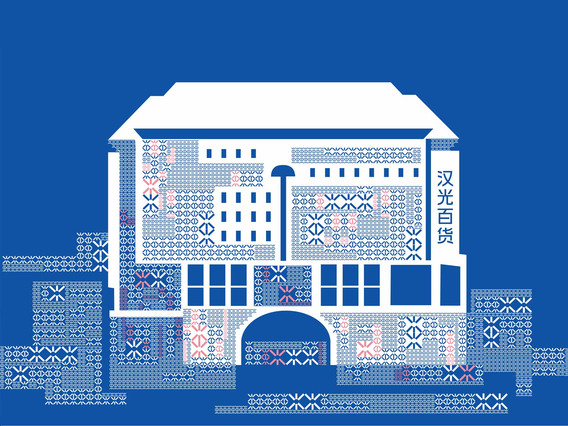
北京汉光百货于2013年正式更名,其前身为北京中友百货,位于西单核心商圈,是北京的地标性百货公司。
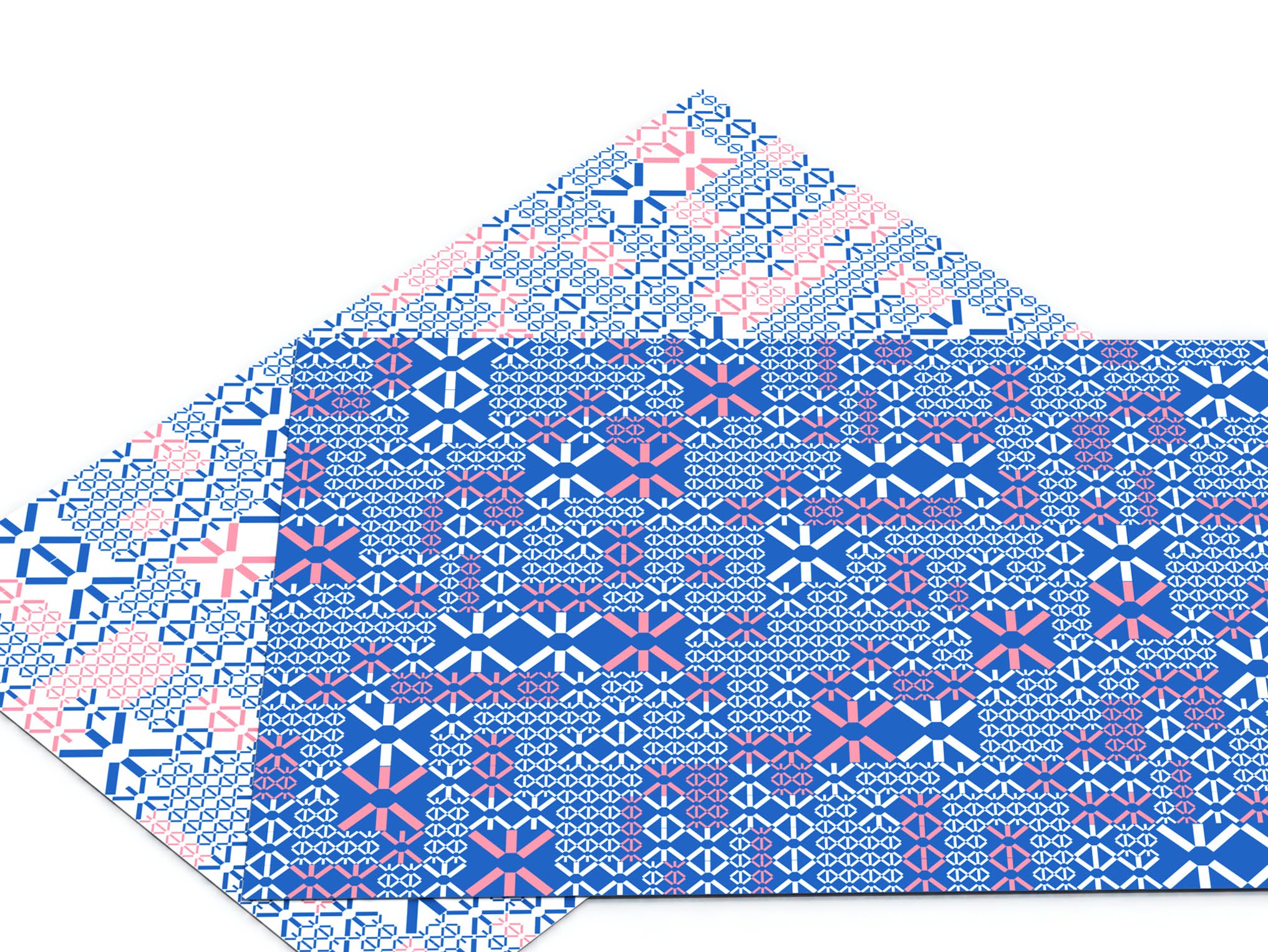
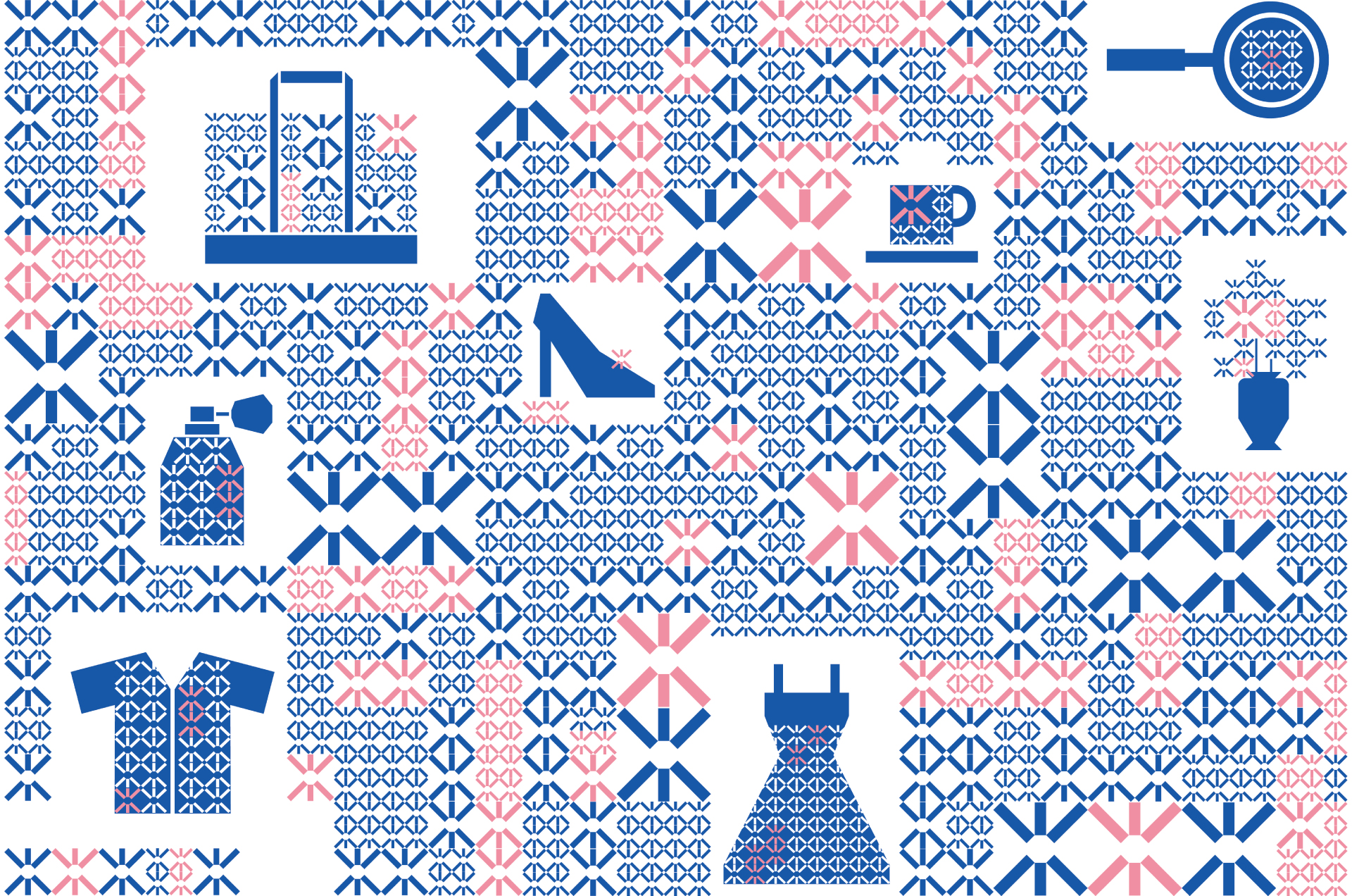
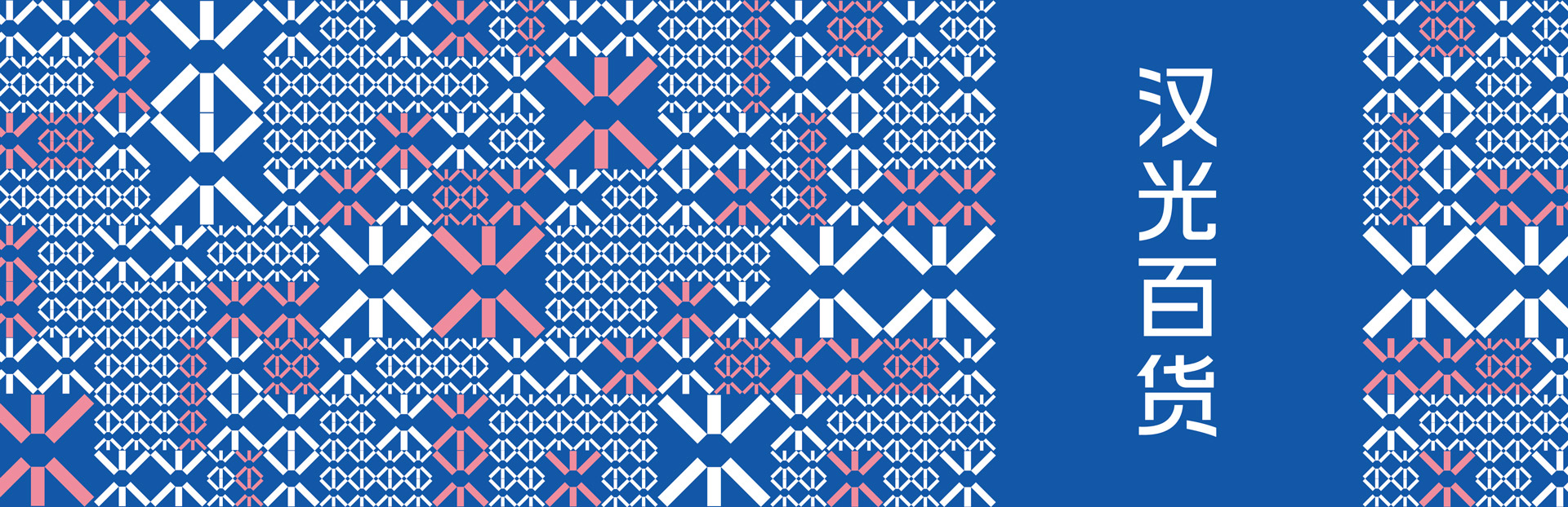
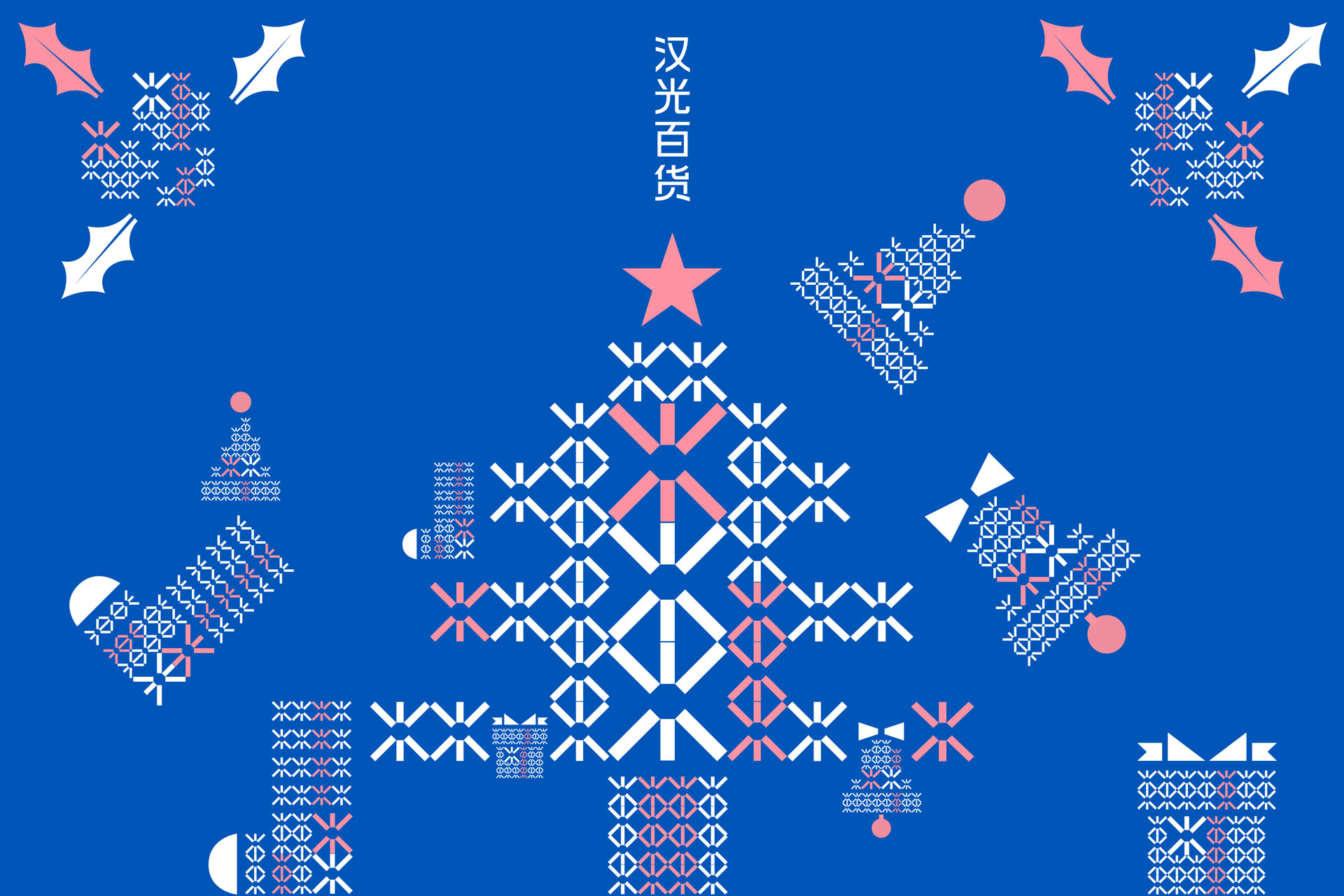
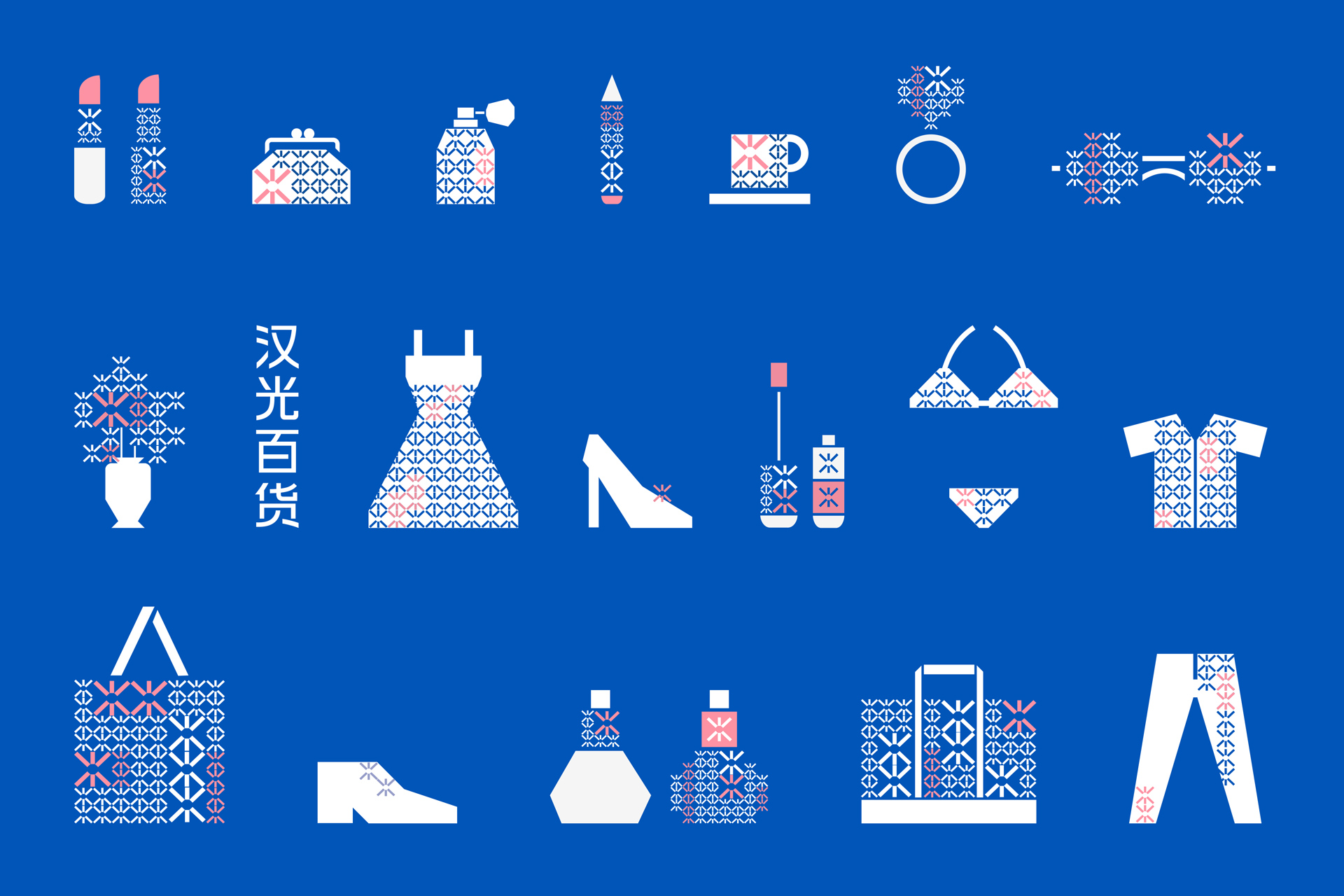
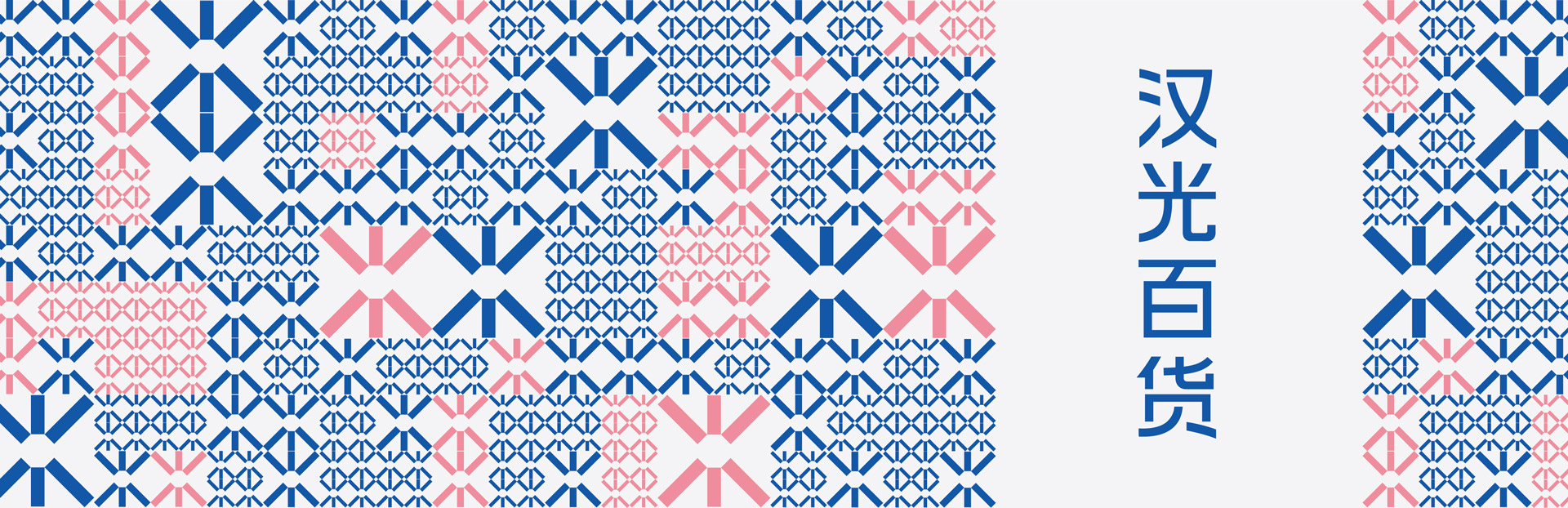
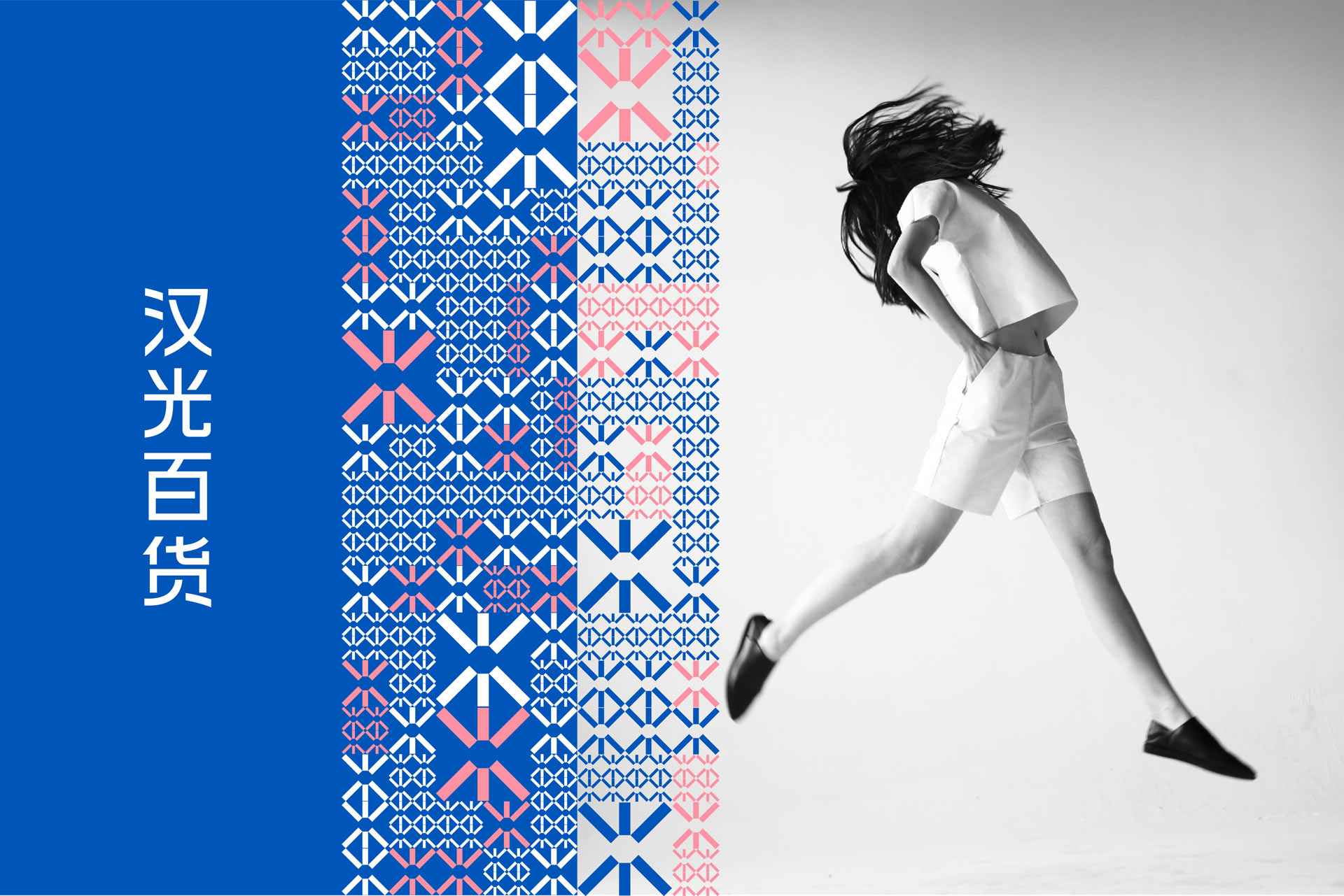
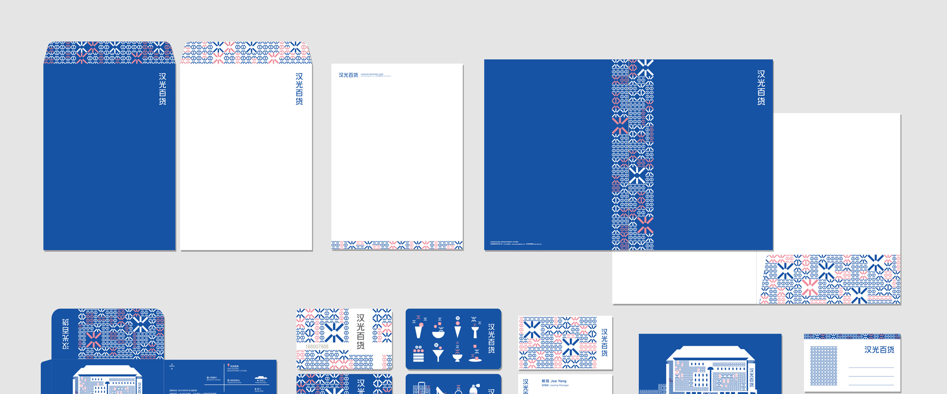
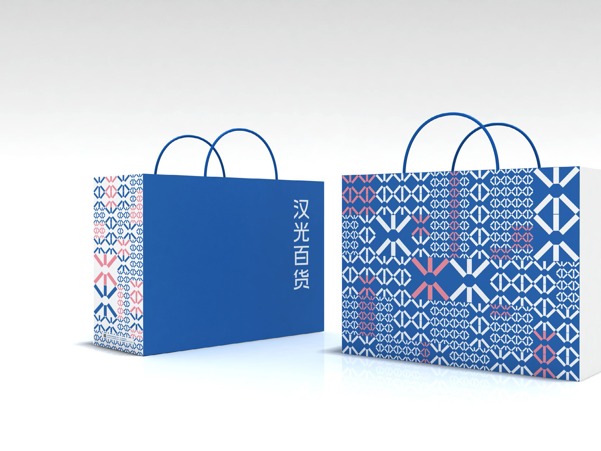
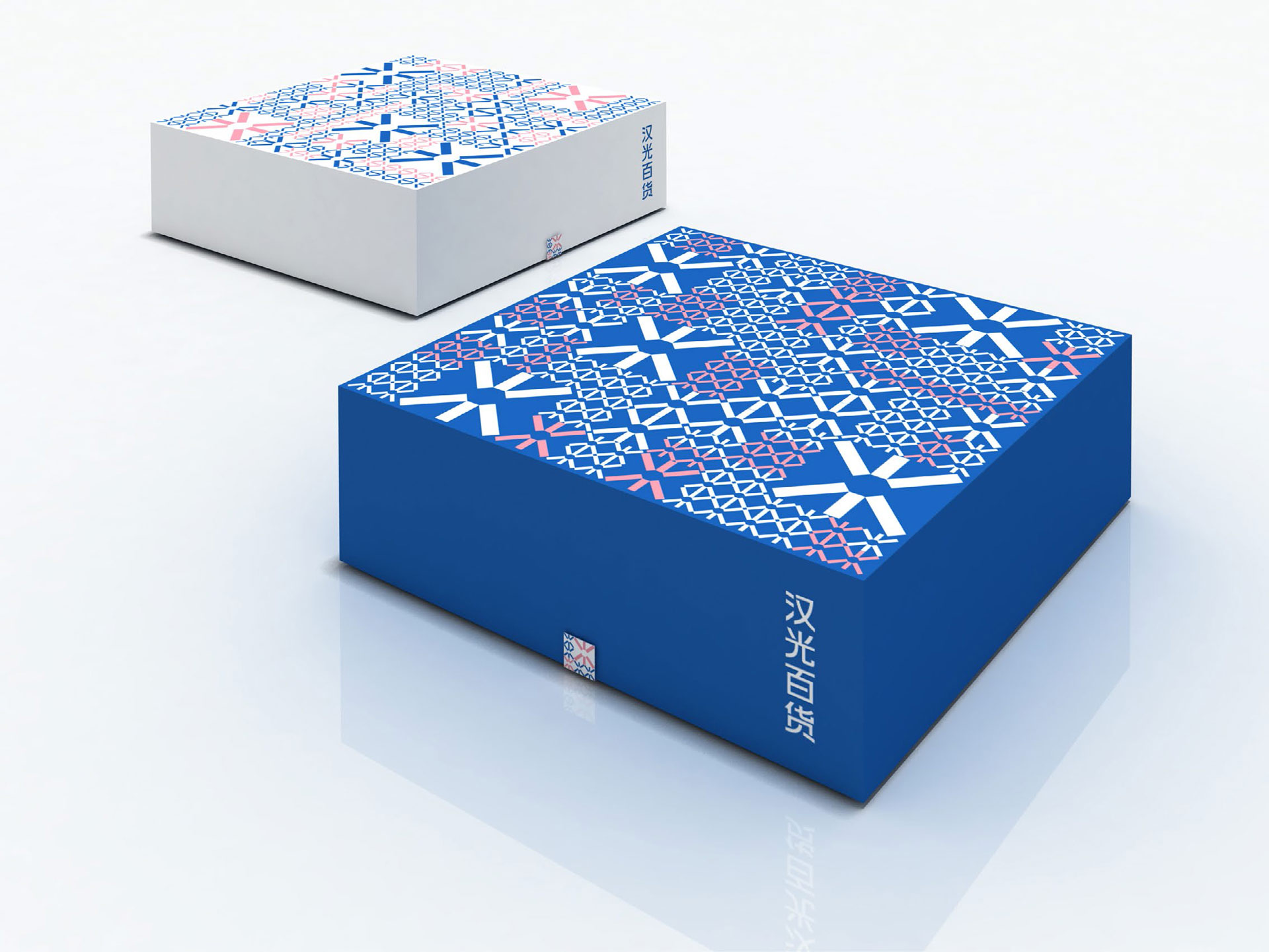
我们为汉光百货进行了品牌视觉形象系统设计。设计以“汉光百货”的中文字体为视觉主体,延续了原“中友百货”的蓝色视觉基调,并加入了柔和的粉色,以增加百货的时尚感。视觉延展元素,取自“光”字的上半部分,映射反转形成品牌的超级符号。视觉系统基于此符号的重复,构成汉光百货的建筑外立面、消费产品等,共同构成了品牌的视觉体系。
Beijing Hanguang Department Store has been officially renamed from Zhongyou Department Store in 2013. It is a landmark department store located in the core business district of Xidan in Beijing.
We design the branding system. The design uses the Chinese name as the main visual, continuing to use the visual blue of the original brand, and adding pink to increase the fashion sense of the department store. The visual elements are taken from the upper part of the Chinese word "light", which is mapped and reversed to form the super symbol of the brand. Based on the repetition of this symbol, the visual system constitutes the architectural facade and consumer products of Hanguang Department Store, which constitute the visual system of the brand.
此项目侯颖在wx-design期间主导完成的项目 / This project was completed by Ying Hou as the Art Director during woring at wx-design.