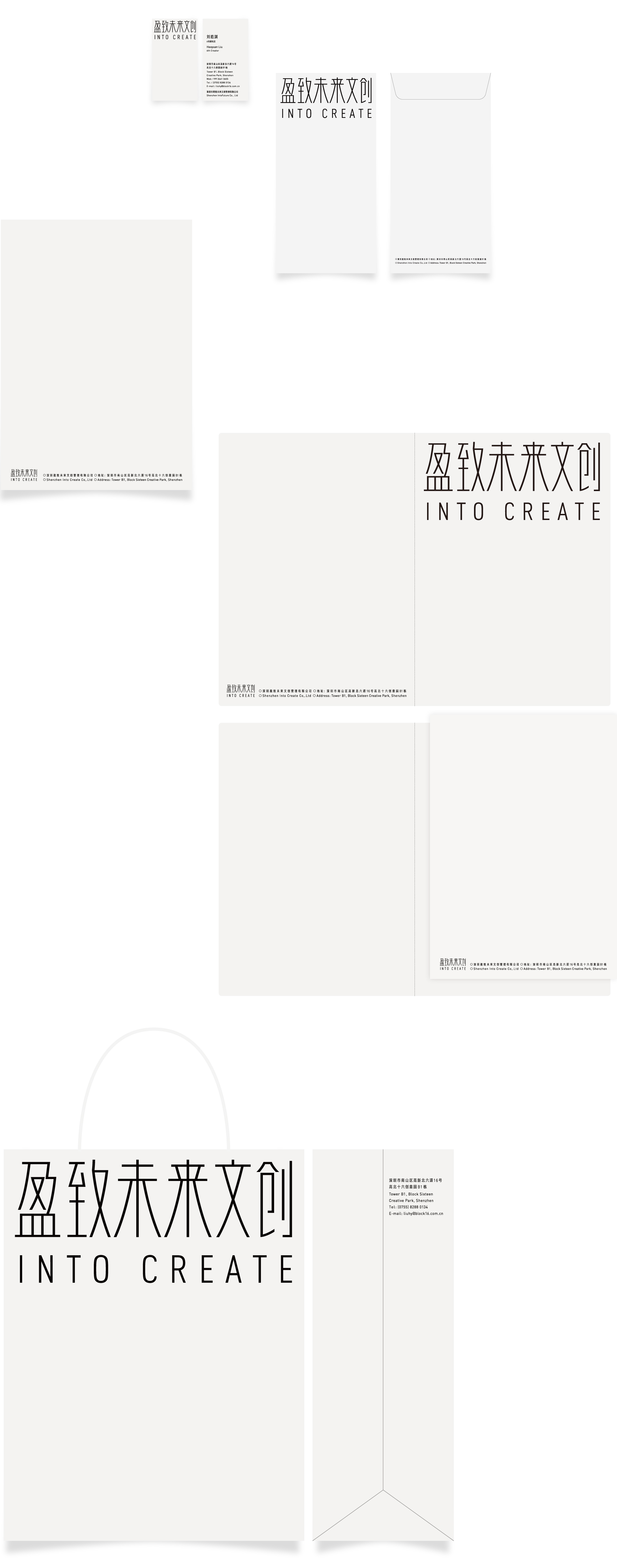
盈致未来文创,是盈投置地旗下的文化产业平台。我们以品牌字体作为视觉切入点,在瘦长等线体“盈致未来文创”字体基础上,增加了微妙的曲线变化,传递出品牌作为文化平台的视觉体验。品牌色彩上采用黑白灰,为品牌在兼容不同创意力量的后续过程中,提供了更广阔的包容空间。品牌的视觉延展系统以字标和信息为核心,在品牌建立初期,有利于以最简洁有效的方式建立对品牌的记忆和识别。
在实际使用过程中,我们发现,盈致未来文创的logo和其他众多创意品牌logo摆放在一起的时候,有极强的识别性。
INTO CREATE is the cultural platform of Yinno Land. It aims to connect local creativity with the world's vision, and use the power of creativity to push the city towards a better future.
We use brand fonts as the key visual point. A little subtle curve is added to the thin fonts in order to convey the visual experience of cultural platform. The color of the brand uses black and white gray, which provides the brand with a wider room for inclusion in the follow-up process that is compatible with different creative forces. The brand's visual extension system takes the word mark and information as the core. In the initial stage of brand establishment, it is conducive to establishing the memory and recognition of the brand in the most concise and effective way. In the actual use process, we found that the logo INTO CREATE are highly recognizable than the other creative brand logos.