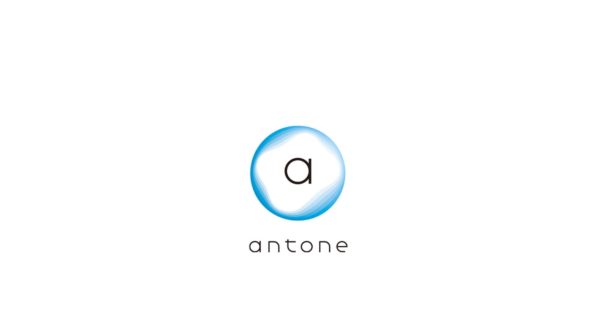
Antone品牌视觉与蚂蚁集团ATEC大会是同一视觉体系。品牌文字采用小写和浅色,以区别于ATEC大会。
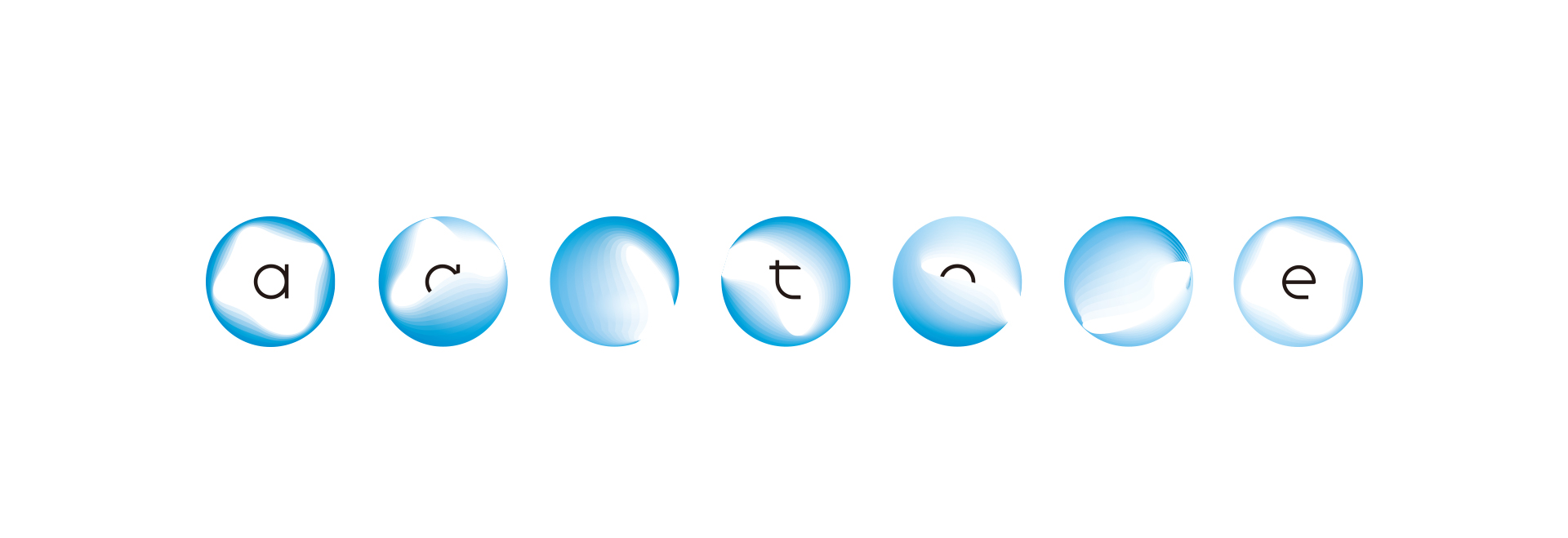
设计从物理学的“弦理论”得到启发,核心图形“圆形”的内部边缘有因为弦的振动而产生的多层曲面,也即弦理论中所认为的所有物质的最基本单位——“能量弦线”。以此来表达品牌以科技助力、为世界带来更多平等机会的理念。


INWADESIGN
COPYRIGHT © INWA CO., LTD. ALL RIGHT RESERVED - 京ICP备18039083号-2
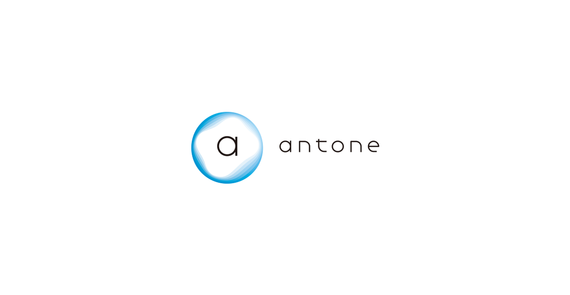
Antone品牌视觉与蚂蚁集团ATEC大会是同一视觉体系。品牌文字采用小写和浅色,以区别于ATEC大会。
设计从物理学的“弦理论”得到启发,核心图形“圆形”的内部边缘有因为弦的振动而产生的多层曲面,也即弦理论中所认为的所有物质的最基本单位——“能量弦线”。以此来表达品牌以科技助力、为世界带来更多平等机会的理念。
The Antone brand vision is the same vision system as the Ant Group ATEC conference. The brand text adopts lowercase and light colors to distinguish it from the ATEC conference.
The visual design of the brand is inspired by the "String Theory" of physics. The inner edge of core graphic – circular has multiple curved surfaces due to the vibration of the string, which is from the most basic unit of all matter in the String Theory -"Energy String". In this way, we express the concept of Ant Financial and ATEC Conference - to bring more equal opportunities to the world with the help of science and technology.