ATEC大会(Ant Technology Exploration Conference)是蚂蚁集团面向全球合作伙伴的前沿技术探索大会,是云栖大会的重要组成之一。
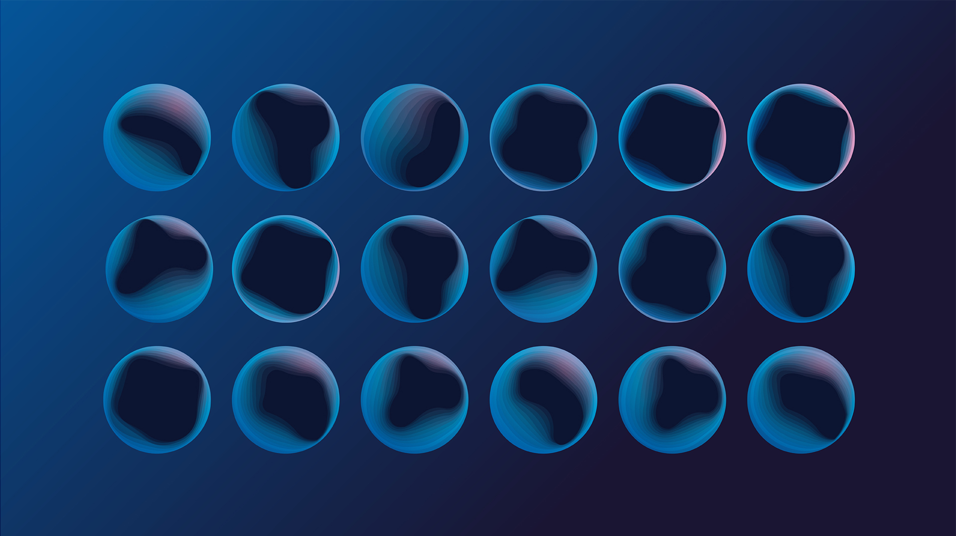
品牌的视觉设计从物理学的“弦理论”得到启发,核心图形“圆形”的内部边缘有因为弦的振动而产生的多层曲面,也即弦理论中所认为的所有物质的最基本单位——“能量弦线”。以此来表达蚂蚁集团和ATEC大会以科技助力、为世界带来更多平等机会的理念。
在色彩上,以表达科技感的蓝色为主,加入一点点粉色,以此来传递ATEC大会倡导的“暖科技”的理念。
我们也为ATEC大会的品牌设计了一套英文字体,以使大会科技感的视觉基调更加统一。
ATEC Conference (Ant Technology Exploration Conference) is Ant Group's leading technology exploration conference for global partners, which is one of the important components of the Apsara Conference.
The visual design of the brand is inspired by the "String Theory" of physics. The inner edge of core graphic – circular has multiple curved surfaces due to the vibration of the string, which is from the most basic unit of all matter in the String Theory -"Energy String". In this way, we express the concept of Ant Group and ATEC Conference - to bring more equal opportunities to the world with the help of science and technology.
In terms of color, blue is mainly used to express the sense of technology, and a little pink is added to convey the concept of "Warm Technology".
We have also designed a set of English fonts for the brand of ATEC Conference to make the visual tone of the conference technology sense to be more unified.