GRAY%是一个水泥创意设计产品的品牌。GRAY%品牌,致力于通过原创概念设计,将水泥这种惯常认为是灰色、坚硬、粗糙的材料,转化为有温度的简洁、朴素、有质感的创意家居产品。
品牌命名基于对水泥的第一印象“灰色”,和水泥产品的核心技术壁垒——水泥和粘合剂材料配比,这两个核心要素。在品牌的命名中,将灰色“GRAY”和百分比“%”符号并置,来直观的传递水泥产品品牌和技术核心优势。
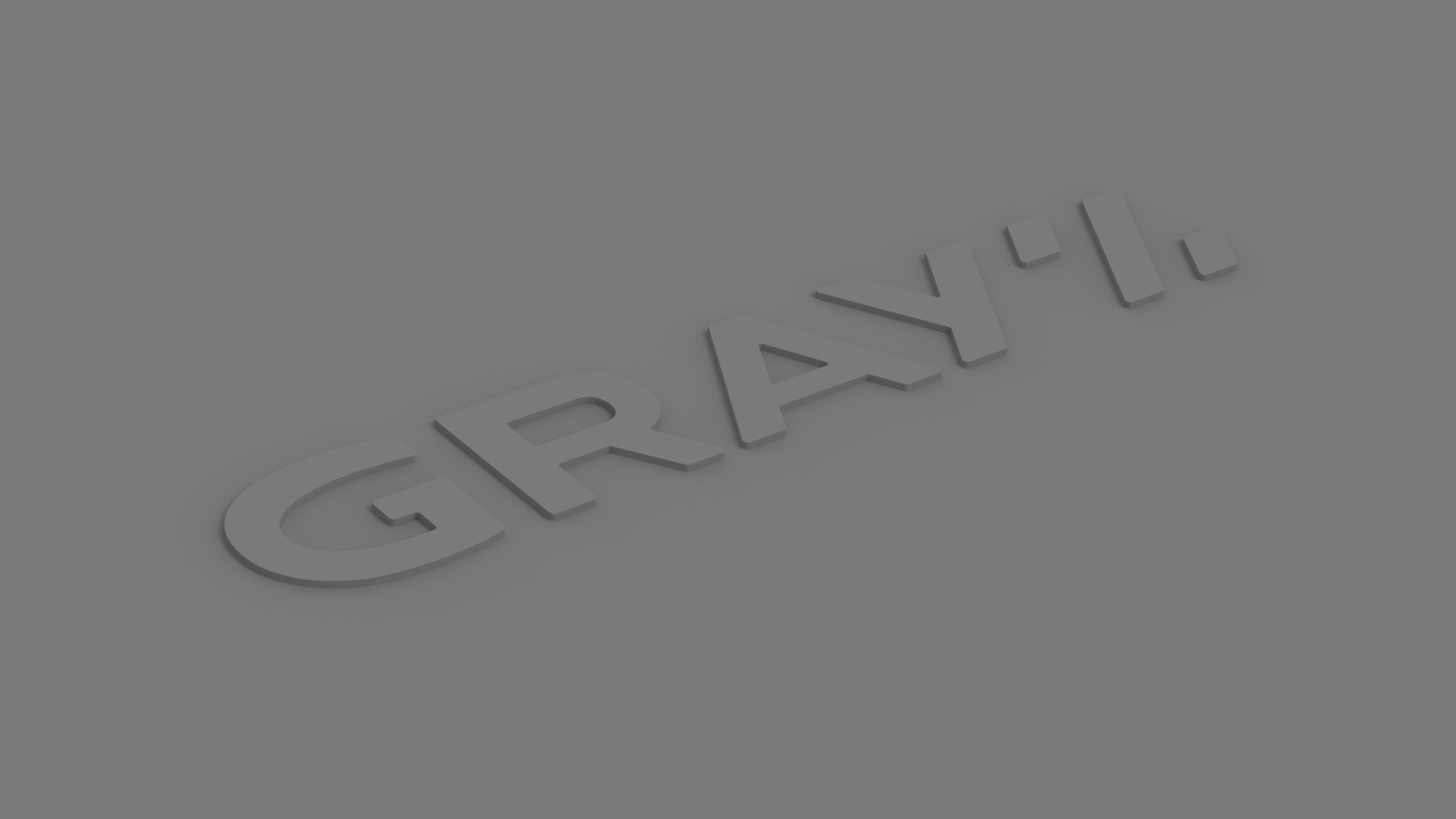
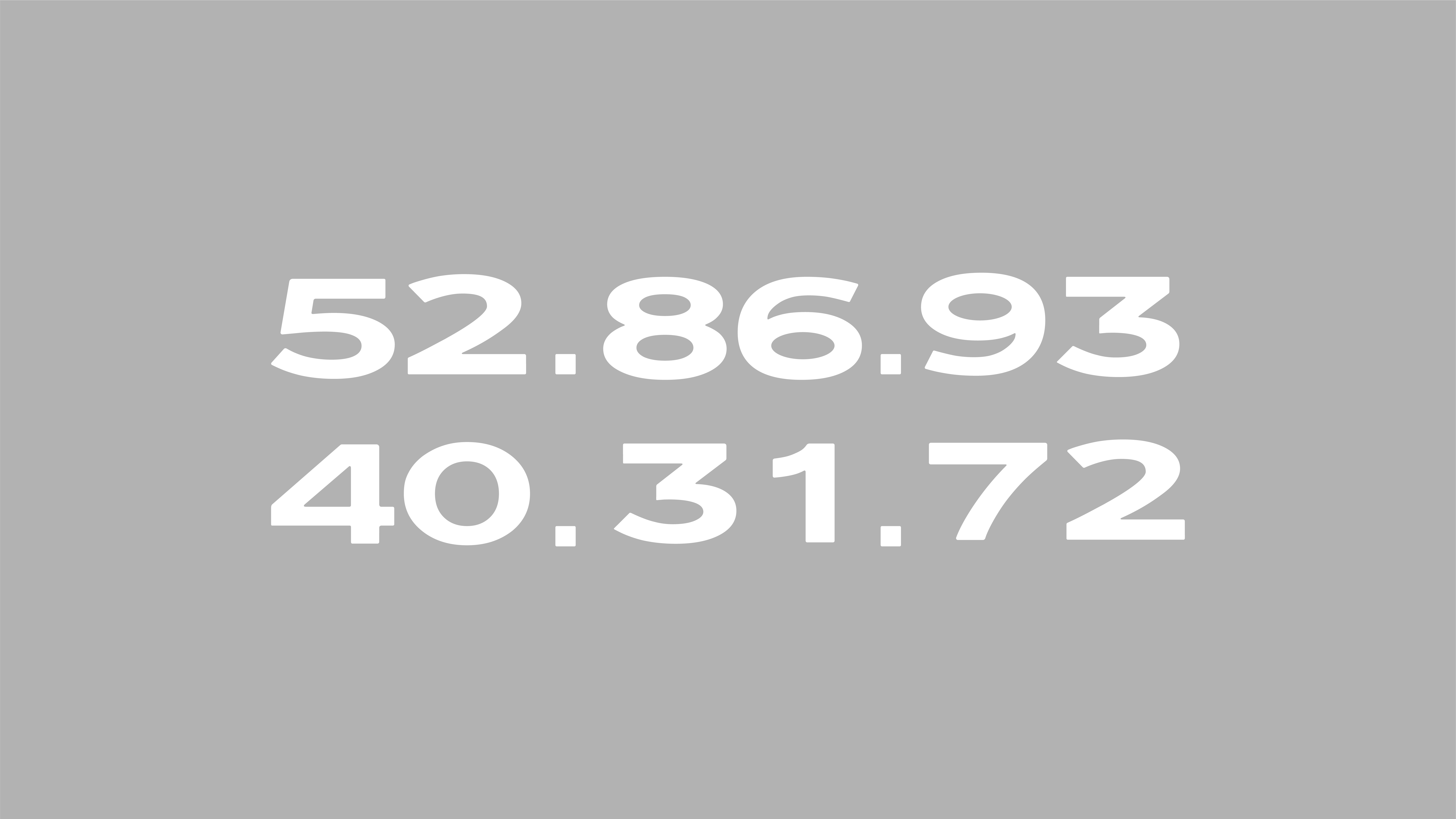
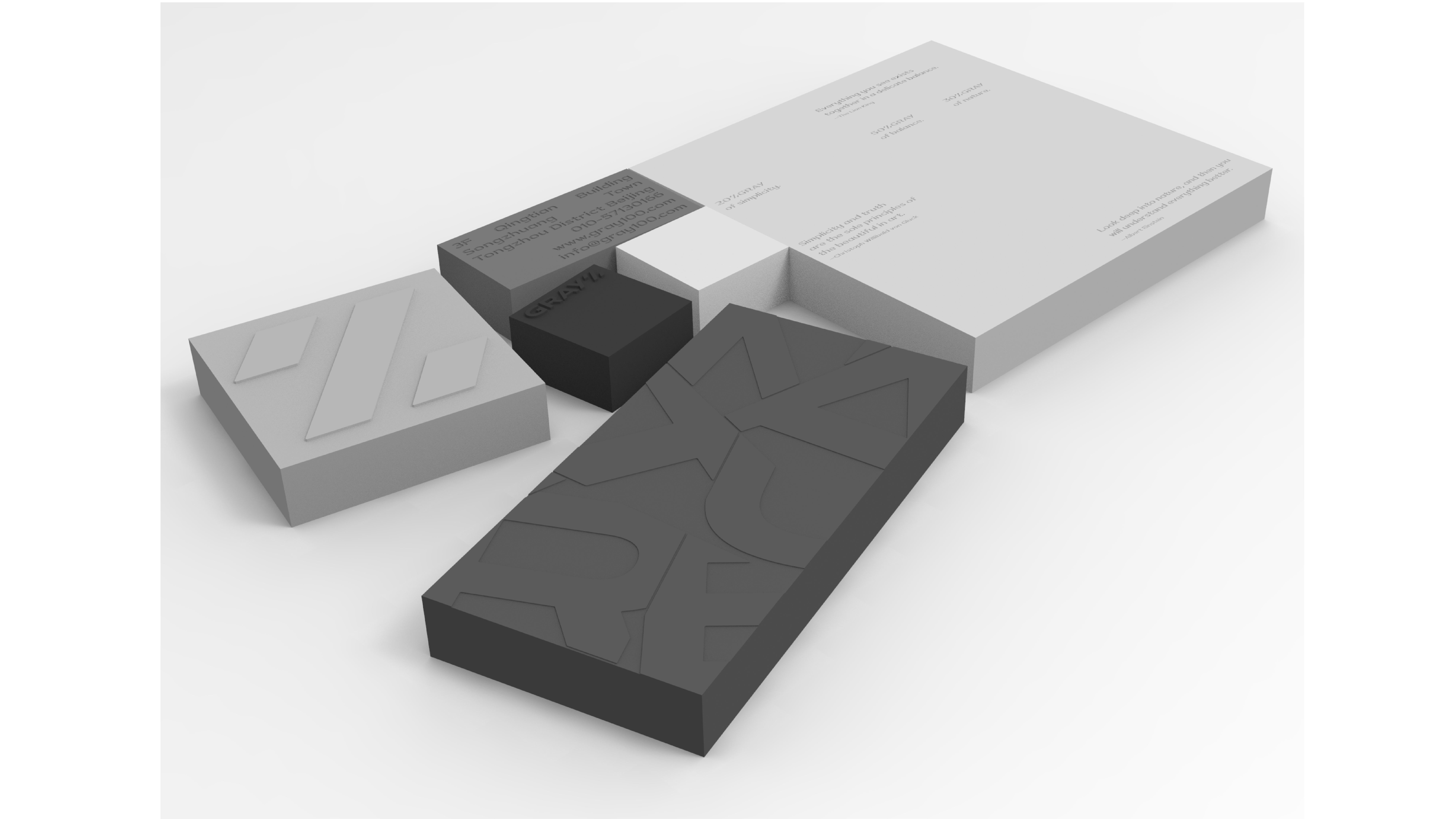
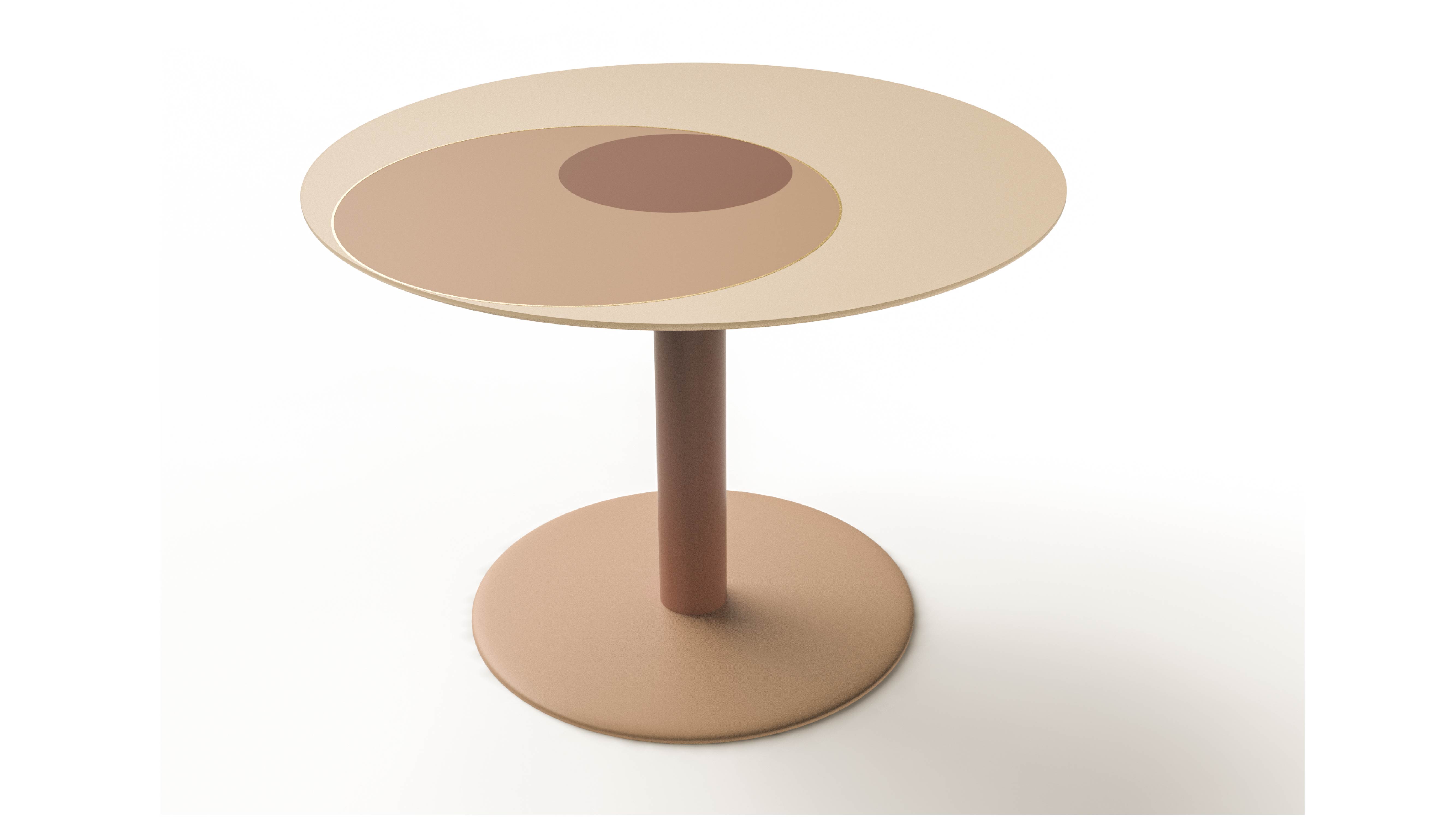
品牌设计将GRAY%所秉承的质朴风格延续到字体设计细节,呈现出简洁、质朴的直观感受。logo在设计时,也兼顾到如何便于logo从水泥制品中脱模成型。“%”符号,既是logo名字差异化的识别记忆点,也可以独立使用,作为品牌的超级符号。Logo的字体细节,体现了对水泥普遍意义认知的设计转换,包括坚硬、敦厚;也通过字体的倒角、%符号等细节,去传递品牌水泥设计产品的细节。品牌色彩,以不同百分比的灰色搭配饱和度低的彩色,在水泥本色的基础上增添色彩的温度。
GRAY% is a brand of cement creative design products. The GRAY% brand is committed to transforming cement, which is usually considered gray, hard, and rough, into a simple and textured creative lifestyle product with a warm feeling through an original concept design.
Brand Naming / Based on the first impression of cement "grey", and the core technical barriers of cement products - the ratio of cement and binder materials, these two core elements. Therefore, in the naming of the brand, the color "GRAY" and the symbols "%" are juxtaposed to intuitively convey the core advantages of the cement product brand and technology.
GRAY% is a brand of cement creative design products. The font details of the logo reflect the design transformation of the recognition of the universal meaning of cement, including hard and honest; also through the chamfering of the font, the % symbol and other details, to convey the details of the brand cement design product. In addition, an important consideration in logo font design is to facilitate the release of the logo from cement products.


