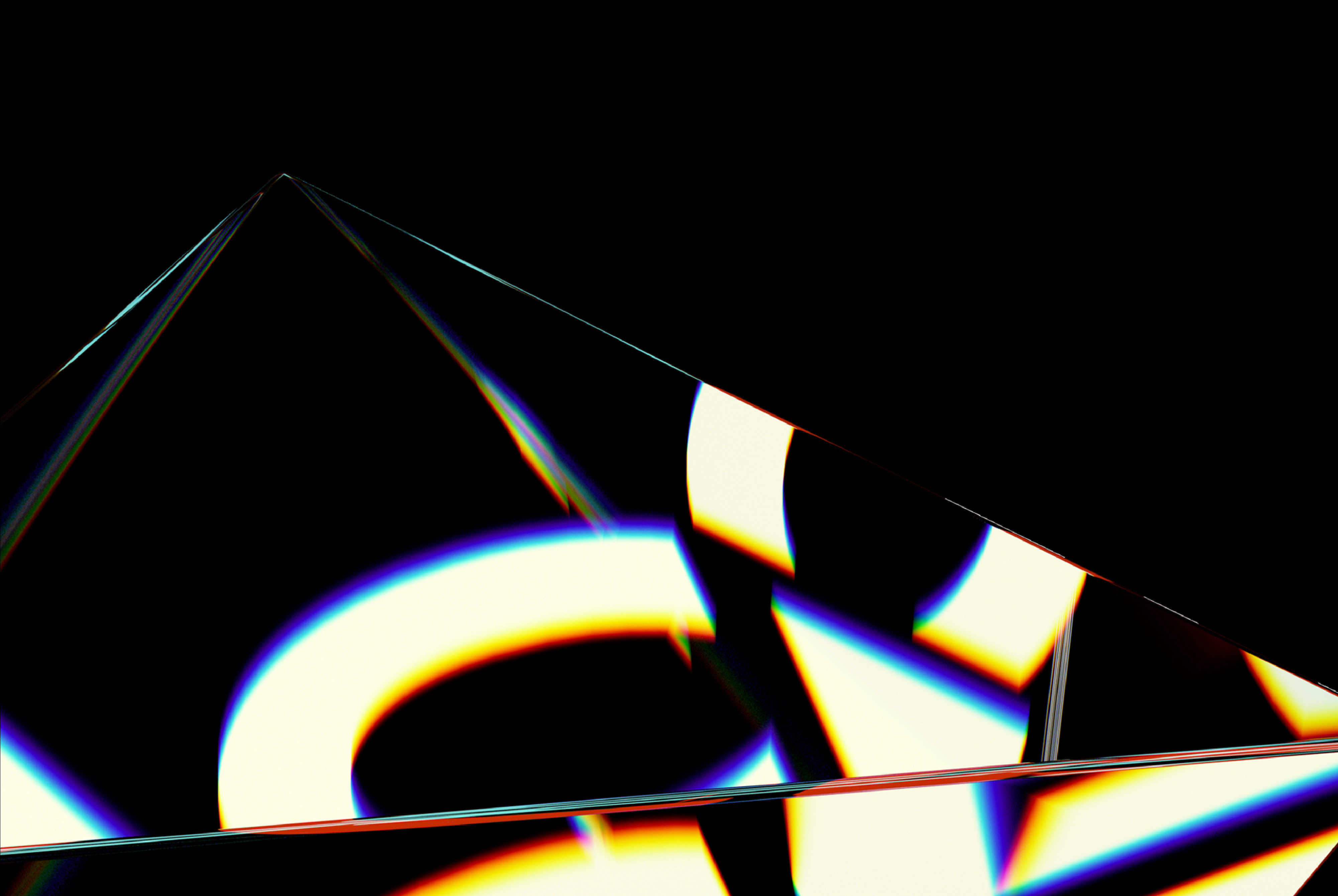
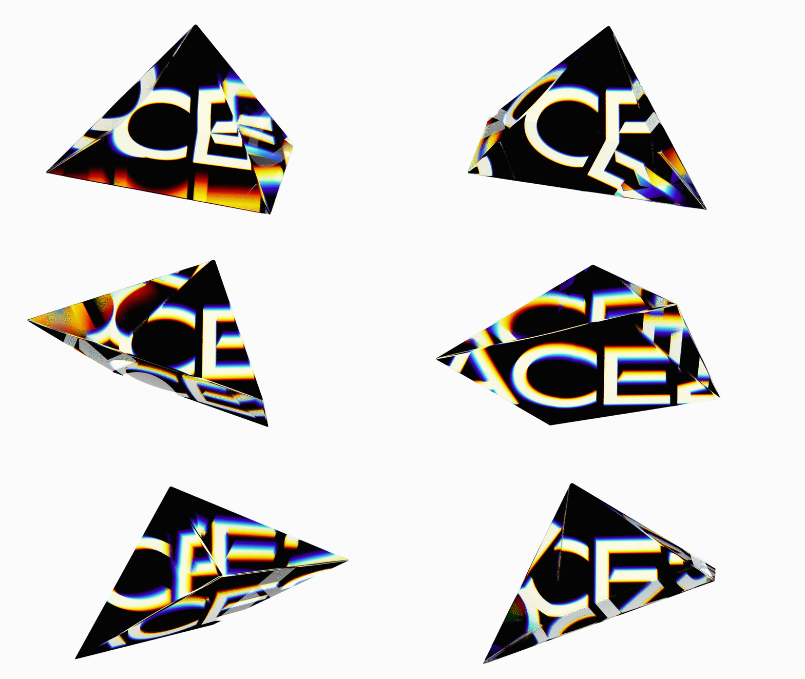
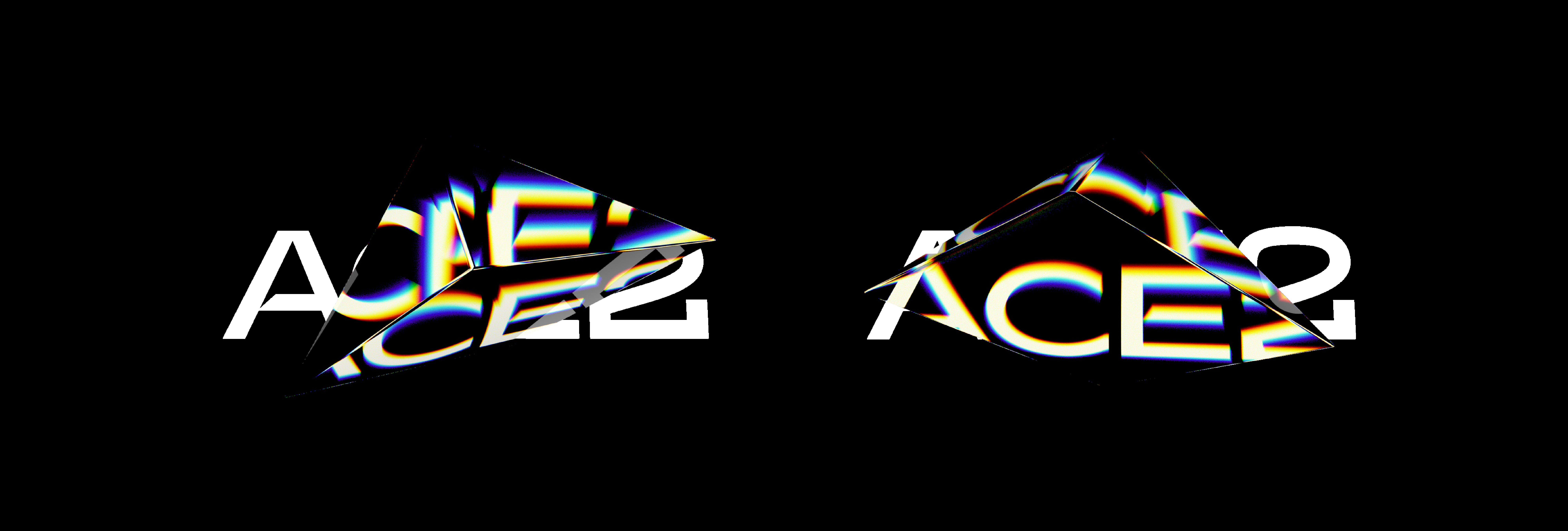
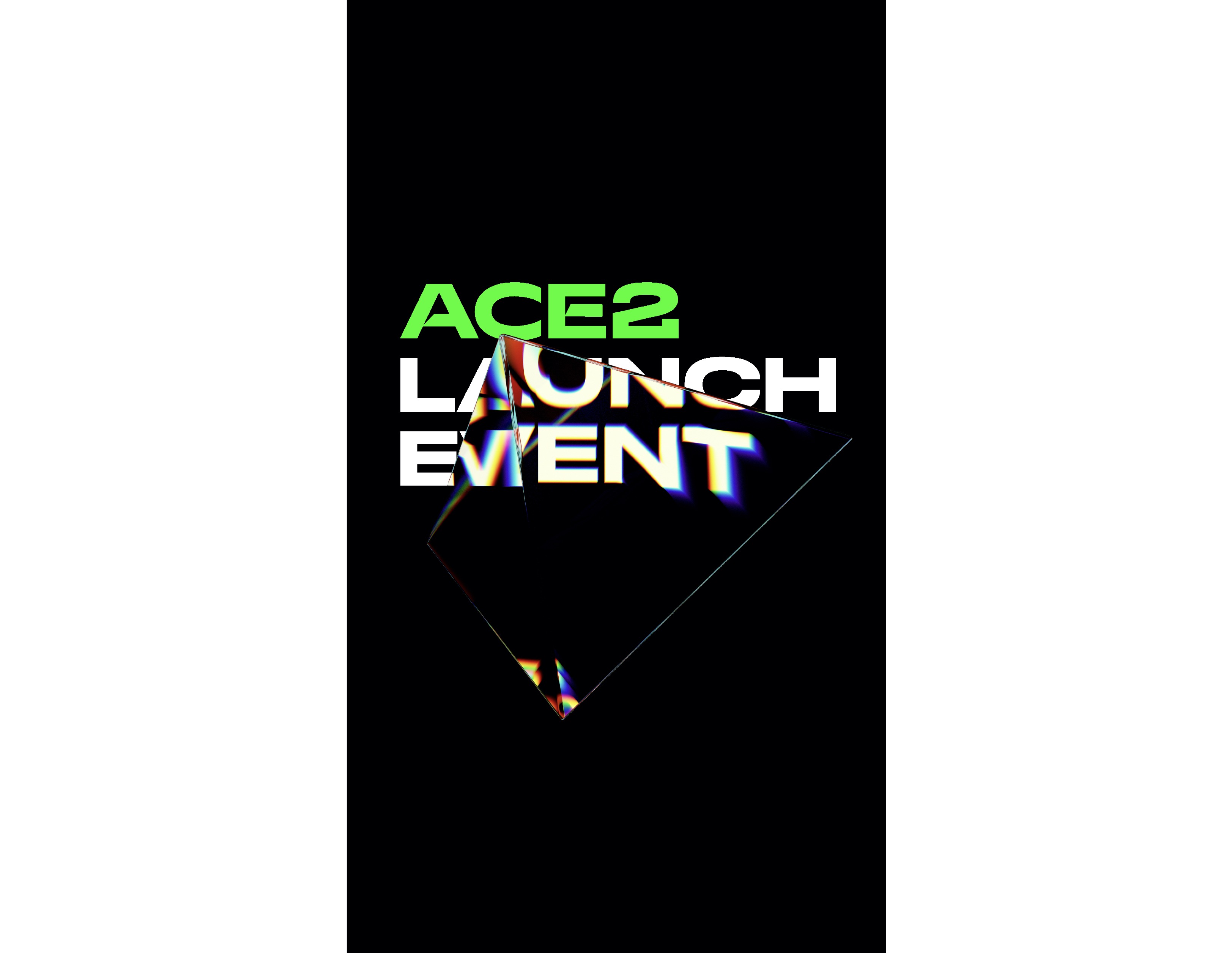
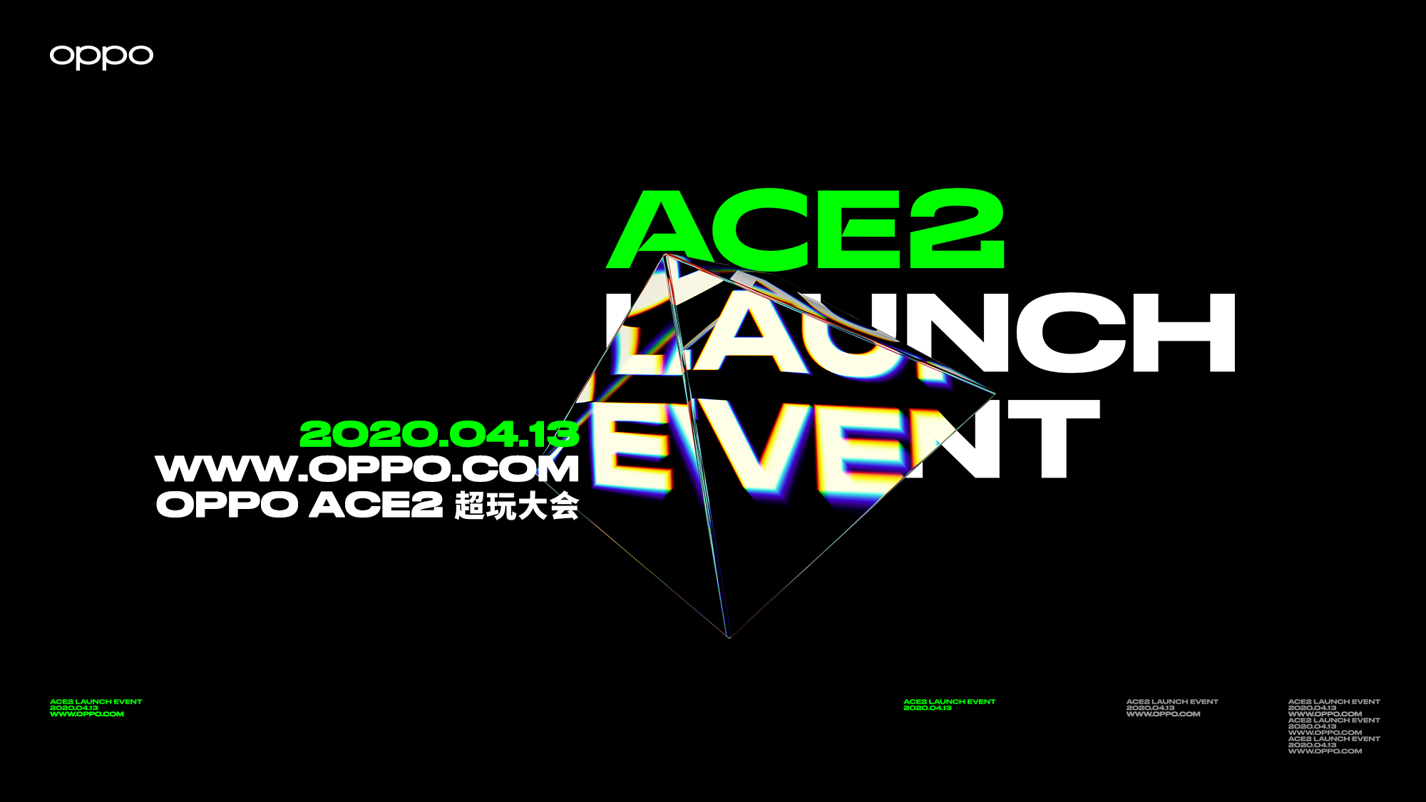
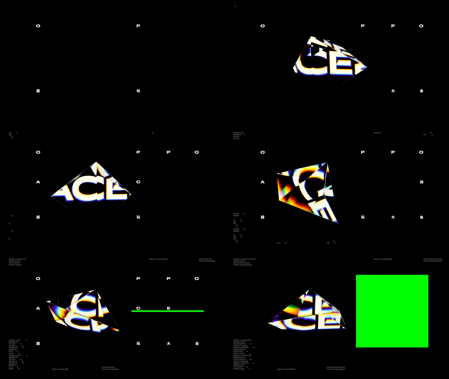
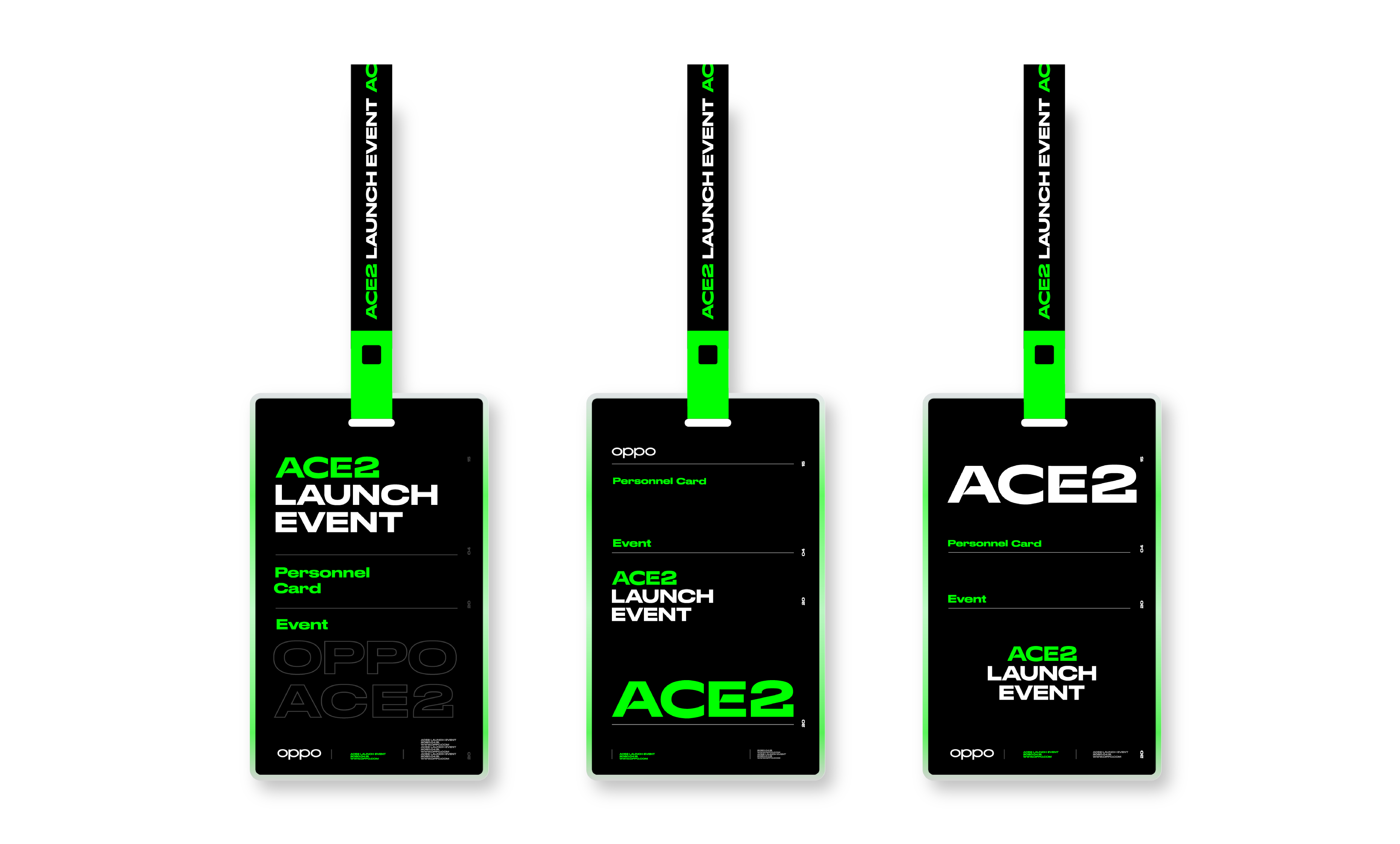
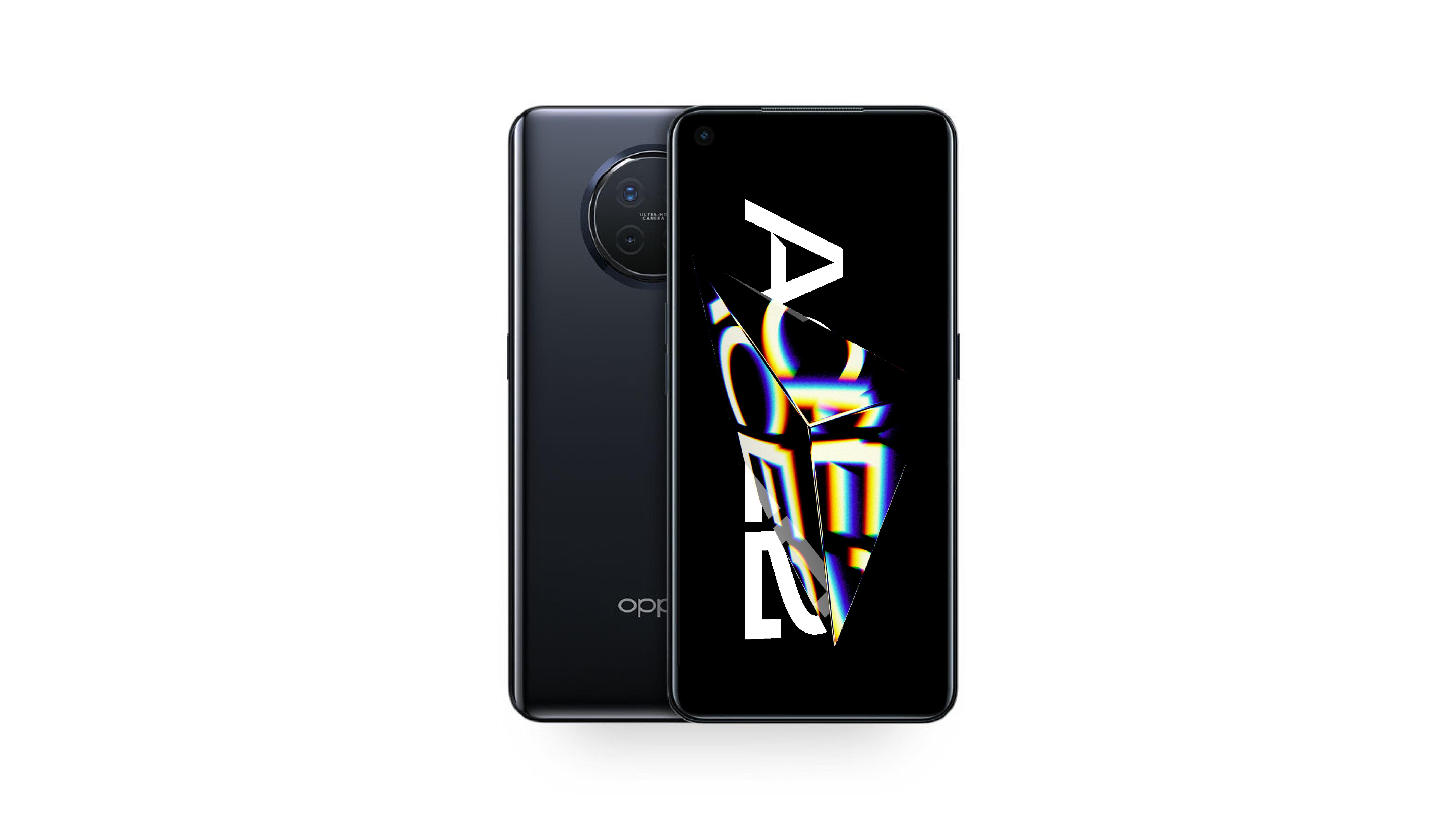
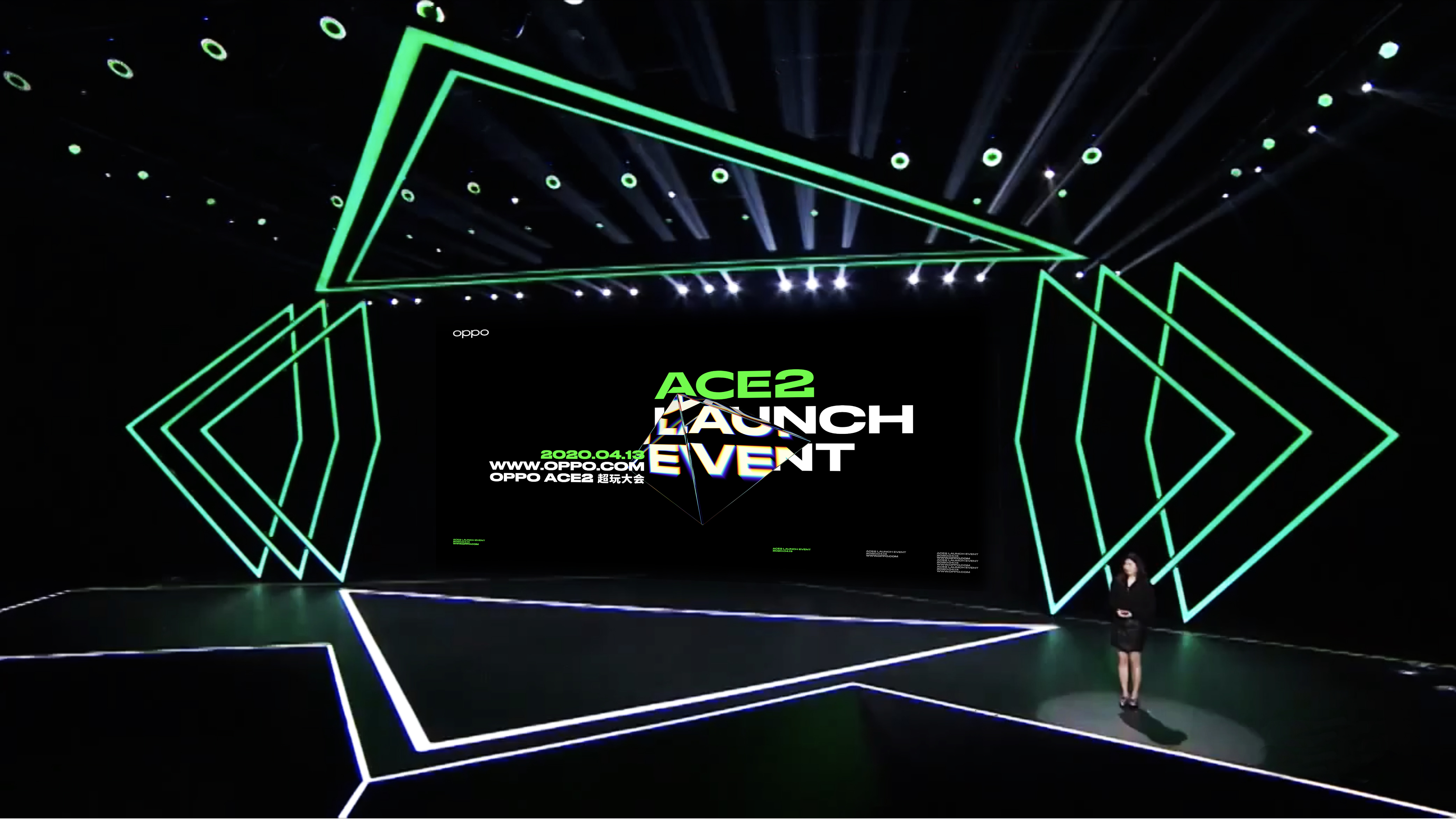
OPPO Ace2是针对电竞玩家和对电竞游戏感兴趣的用户打造的专属超级玩家手机。基于手机的定位,设计选择以三角形为视觉主体,采用透明材质的锥体映射出文字,以此方式体现游戏感、速度感、屏幕视觉精细感。动态上结合信息频闪的方式,强化游戏手机的代入感。因为疫情的原因,此次发布会从线下转为线上。我们负责设计了“OPPO Ace2 超玩大会”的视觉、开场视频、动态邀请函和转场视频等。
针对OPPO对Ace2手机的定位,Ace2提取“A”转化为三角形作为开场视频的核心视觉元素,采用透明材质的锥体来映射出文字,来保有合适的游戏感、速度感、设计感。文字排版尝试用大量白色和荧光绿色、实心和勾线的密集性信息构成Ace2视觉基调,并为Motion呈现中的频闪效果做了视觉上的测试和基础。动态设计为了将透明材质的锥体映射文字效果更生动,我们做了大量的质感和动态测试,反复打磨和优化Ace2和标题折射的最佳裁切位置,即保有画面的视觉张力、又不影响核心信息的阅读。
OPPO Ace2 is an exclusive super player mobile phone built for e-sports players and users interested in e-sports games. Based on the positioning of the mobile phone, our design chooses to use triangles as the main visual element, and the cones of transparent materials are used to map out the text, which reflects the sense of game, speed and screen visual fineness. Motion design combined with information strobe, it strengthens the sense of substitution of game phones. Because of the COVID-19, OPPO’s press conference changed from offline to online. We are responsible for designing the vision, opening video, invitation and transition video of "OPPO Ace2 Super Play Conference".
"A" is extracted and transformed into a triangle as the core visual element of the opening video. Transparent cones are used on the material to reflect the text to maintain a suitable sense of game, speed and design. The text layout uses a lot of white and neon green, filled and stroked dense information to form the visual tone of Ace2, and provides a visual test and basis for the stroboscopic effect in the Motion presentation. In order to make the reflection effect of transparent materials more vivid in dynamic design, we have done a lot of tests and repeatedly optimized the best cropping position of Ace2 and refraction, so that it retains the visual tension of the picture without affecting the reading of the core information.
